I thought some of my readers might be interested in seeing how a lunchbox doodle starts as a blank 3″ x 5″ index card and ends up being its finished product. The isn’t the process I always use to doodle (sometimes I go do ink straight on the card and skip penciling) but it’s how I produce my highest quality work.
Starting Supplies
First, let’s discuss supplies. I use white, unruled 3″ by 5″ index cards. These come in packs of 100 and I get them from Target. For every doodle, I average four cards: one for pencil, one for ink, one in case I have to start over, and one for keeping my pencil lead pointed like I prefer.
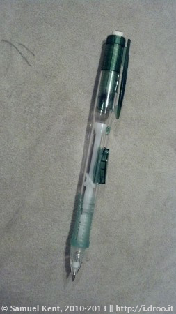
I am a fan of big, fat, automatic pencils. This is what I started drawing with twenty years ago and it’s what feels most comfortable in my hands. I like an 0.5mm lead because it can make heavy and super-light lines. You also never have to stop to sharpen. Note also that every pencil has an eraser. Use it.
When I’m drawing, I often sit on my couch. I don’t need much space for stretching out, so I use a lap board. This particular board is a Gessoboard, which is a piece of melamine coated in primer. It’s supposed to be used in acrylic painting as a canvas, but I like them as lap boards for a lot of reasons.
- They have the slightest bit of texture to them, which helps keep the cards in place as I sketch.
- They come clean with Windex.
- They’re thin and lightweight.
- They only cost about $2.00.
Pencil Process
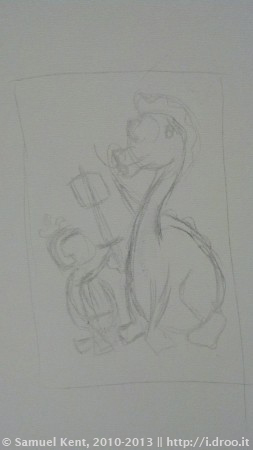
The doodle starts with an idea, but sometimes my ideas are bigger than an index card. I draw some thumbnails right on the Gessoboard to get an idea about the best way to layout my doodle, or see if I can make an idea fit better in a vertical or horizontal presentation. This takes about a minute.
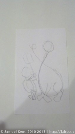
After I’m happy with my thumbnail, I draw it again, but this time on an index card. This is where I start paying attention to head positions and counter-posture of my subjects (which is basically checking that their shoulders and hips work together the right way). I also try to exaggerate the curvatures of spines a little more than was in my thumbnail.
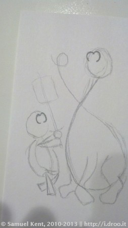
The placement and shape of eyes really sets the tone for the characters and lets you understand their emotions. It’s also the easiest thing to mess up, so when I start adding more concrete details, I always start with the eyes.
My friend Dave notes – of the way I draw eyes – that it looks like an apple cut in half vertically. I can see that (no pun intended). I started drawing eyes like that when I was very, very young. I used to watch a show called B.J. and the Dirty Dragon, and another called Gigglesnort Hotel. Bill Jackson, the host of those shows, crafted eyes this way on some of his puppets.
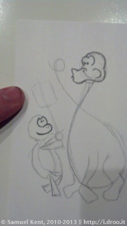
Heads and mouths are also important to get right. One slip of the pencil and your subject isn’t present in the drawing anymore. I get the basic shapes of these and then move on.
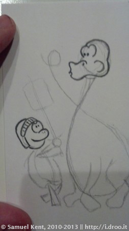
Next, I went ahead and put the helmet on the tortoise. I did this so I would have an idea of how big a plume I could put on there and whether I’d need to re-block the doodle to make a better one.
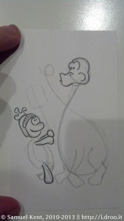
I’ve found that if I put the wrong amount of detail into a hand, it steals the focus in the entire doodle. If you get it just right, despite the amount of effort spent, the hands are ignored. If it’s completely cartooned (like the “paddle hands” I draw), it’s less effort, and equally ignored. But if you put not enough effort into making more complete hands, it looks lazy. I err on the side of cartooned and easy.
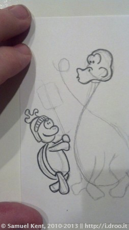
With head, hands and feet in place, the rest of the body is pretty easy; just lines to connect the parts. I happen to know what a tortoise body looks like, but Google image search makes a good reference if I don’t.
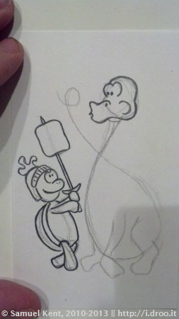
Since I know that the marshmallow in my subject has to be the dragon’s focal point for both fire and his eyes, as well as the tortoise’s eyes, I drew this in place first, and then the rest of the sword down to the hands.
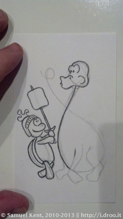
I like coming up with formulas for animals and characters. A dragon or dinosaur body is basically an egg shape with two counter-postured lines for the head and the tail. I’m going to make sure that the front of the neck is in place before I draw the feet.
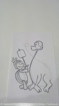
I draw feet with about the same effort I use to draw hands. You can see the thicker lines around the toes to make sure I’m getting the angles of the arches right. I still don’t know how thick the neck is going to be.
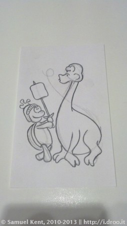
Once I round the backside and belly of the dragon, I have a better idea of how heavy/light it’s going to be. I feel more comfortable with a slender neck as opposed to something more stocky.
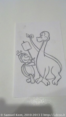
The neck is slender, so it makes sense that the tail is also slender. I draw it a thinner than the neck to imply some depth; smaller appears farther away in simple design terms.
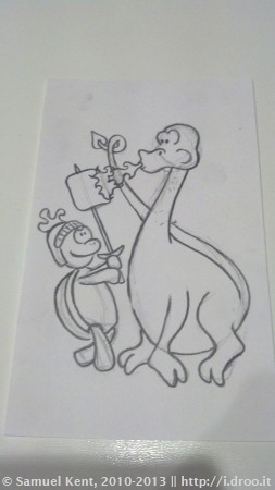
Not being in my thumbnail or blocking, this is the first I’ve drawn the fire. I made two layers of flames to help imply motion. Artistically, the layer closer to the mouth ends where the tail lines have been erased, which is aesthetically pleasing. This is complete coincidental, but you kept reading anyway.
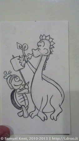
Without some further decoration, the head of this dragon seemed a little too brontosaurus. I tried to make the spikes make match the fin on its tail. Here, too, I make a mental note that with the spikes, the dragon doesn’t look menacing enough, so I plan on changing its eye ridges when it’s time to ink. I also colored in the tortoise shell, but I’m unsure if it’s the right thing to do in ink yet.
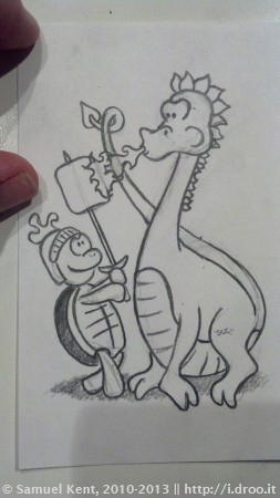
I tend to fill my doodles as much as I can, and since these characters aren’t in battle in some Matrix-style construct without dimensions, I give them an under-shadow. Now they’re standing on something, but what? One imagines that they’re standing in a place where a knight and a dragon would stand; either a cave or a castle or somewhere near there. I choose a hilly field beside a castle because drawing a cave seems boring.
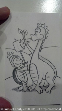
Hills are pretty easy to draw. They are just a bunch of curving lines and arches. I want some closer and some farther to give the drawing depth. Since I also want there to be a castle in the background, but I want it away from the action of the tortoise vs dragon, I vault the hills pretty high.
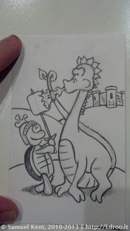
The castle looks like it’s in the background. Why? It’s elevated, it’s small, it’s off to the side. None of this was coincidence. The fact that it looks like the Kings Castle LEGO set is a complete coincidence.
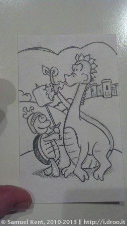
I have never been asked why I always put clouds in my doodles. There are several reasons:
- Clouds keep there from being so much empty space at the top of the doodle
- It’s a throwback to every drawing that I did as a kid, and most of the drawings I see kids draw today. Who teaches us that?
That’s it for the pencil process. Time to ink this baby.
Inking Supplies
Inking is a lot like tracing. In fact, that’s exactly what it is at the start, but it involves adding some depth and character to the drawings with some artistic texture techniques. At least that is what I tell myself to feel less guilty about tracing, which has always felt like cheating.
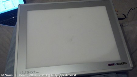
I use an LED LightPad for inking. It’s basically a really thin light box, like people use for tracing photos onto paper. I could use tracing paper instad of another index card, I suppose, but tracing paper is too thin, too expensive, and it wouldn’t stand up in a lunchbox.
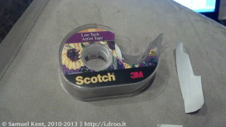
Low Tack is basically masking tape. It sticks about as hard as a post-it to the paper, but pretty firmly to the LightPad’s glass surface. I use this to hold my final doodle on top of the pencil doodle.
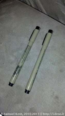
One of the questions I am asked most often is what kind of pens I use. I’m a fan of Sakura Pigma Micron 005 and Brush archival pens. These are typically used in calligraphy and scrap booking. I go through about one of these a week, and at $3 apiece, that means $0.30 / doodle just for a pen. That said, the ink is waterproof, it dries immediately, and it doesn’t stink like India ink. The 005 is .2mm and is what I use for all of my lines, hatches and pointillism. The brush pen is for my widest strokes and solid black areas.
Inking Process
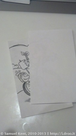
I take the final card and lay it over the pencil work. Sometimes I’ll realize that I got the angle of the pencil drawing (or elements of it) wrong and I’ll ink one section, rotate the card, and ink another. Low tack comes in handy here since it doesn’t stick to the art. You can see the original design through the final sheet, but not well. It needs light, and for that, I fire up the LightPad.
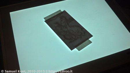
The LightPad makes the lines I’m tracing very, very evident. To get an idea how bright it is, note that the line is shining through two sheets of paper and the thick tape on top of them. It’s enough to make me squint.
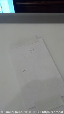
As with the pencil, I will ink the eyes before anything else. I’ll get this wrong more than anything else, and in fact, this image is the second attempt at inking the eyes. I remembered that I wanted the dragon’s eyes to seem more menacing, so I flattened the top of them to look more like a scowl. Bringing the tops of the tortoise’s eyes together also make it seem more playful and less fearless.
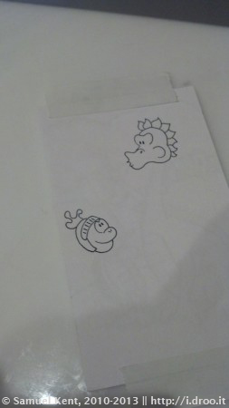
I usually do the heads after the eyes, just as with the pencil. I don’t particularly have a reason for this with ink, unless the characters have hair or ears that I want to get right.
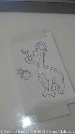
I will go ahead and ink an entire character, or if there is only one, the main character subject. I did the flames first, then the legs, then the body and finally the tail for this guy, mimicking actual layers of life/action.
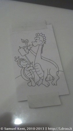
I ink the remaining tortoise character next. I did it as arms and legs, then the body, then the marshmallow and sword, just as with the pencil. I also went ahead and drew the main hill for the setting.
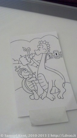
With the main subjects done, it’s time for the background. I do everything except the clouds, which will require me to move the tape. With that, the main lines are complete, and I switch back to the Gessoboard for its lighter weight. Now, to add some depth.
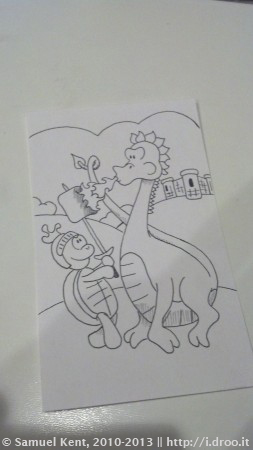
Hatching is a technique of creating shadow and separation with a series of parallel lines. I added hatching to the underside of the dragon and to the burned portion of the marshmallow to show that they are rounder (or in the case of the marshmallow, burnt).
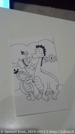
The darkest part of a drawing tends to draw your eyes. I start by coloring with the brush pen all of those parts that I intend on making black. What this will tell me is if I need to make other parts darker (like the tortoise shell or shadow) to bring the eyes down into the action. Since I want the tortoise to be more important than the dragon’s head fins, I decide that the shell will ultimately need to be darker.
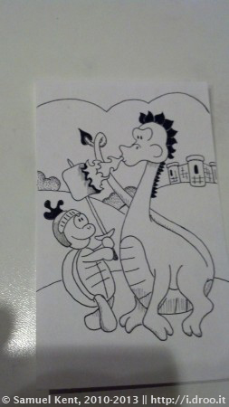
More hatching reinforces the roundness of the legs, toes and the tails. I also started filling out the bushes in the background with a technique called pointillism, which is simply filling space with a series of dots. It’s a good method for mimicking a gradient when you’re drawing with one color, but it’s time consuming.
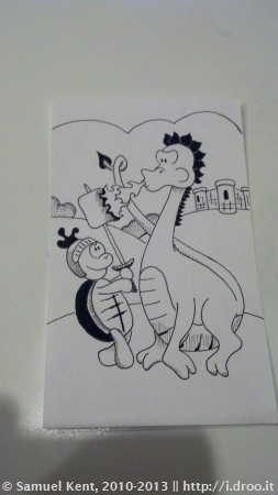
As I had hoped, by making the tortoise shell darker, it draws attention away from the dragon’s head and toward the tortoise. Your eye finds the fire easier. I’m starting to get happy with the outcome, but the dragon seems a little flat, so I darken up the scutes on his belly, and same for the tortoise’s plastron.
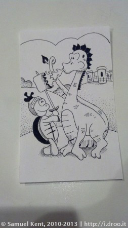
To separate them from the setting, I put the shadow back under the subjects. You can also see that I used that pointillism technique again on the back hills to make them seem rounder. I tend to do pointillism gradients in three passes to get the gradient feel just right. Now, to finish the foreground and the clouds…
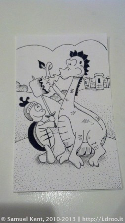
I repeat the gradient technique for the hill on the foreground. The points are not as densely drawn together. This makes the fore hill seem closer. Conversely, if I had made the dots a lot darker but kept the same basic density, that would have also made the hill seem closer, but it would have required another pen. I’m nearing the finish line now!
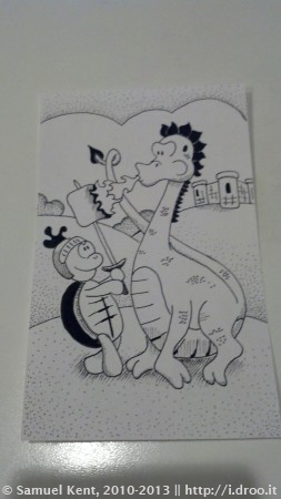
The last thing I’ll gradate with pointillism is the sky above the clouds. The stark difference between the clouds and the sky helps the eyes see one more layer of depth.
Final Product
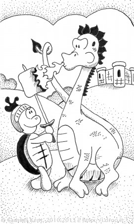
The last things I do are off the board; I scan the image, and modify the blacks and whites to make dark areas darker and light areas lighter. I do this because the index card paper isn’t precisely white and that makes the presentation look better online. Following that, I number and date the doodle on the back (and usually make a note about the intended boy for the particular doodle).
Andrew usually gets a poem with his doodle, but writing the poems is a completely different process. Go check out this doodle’s post to read the poem.
Share with me the things YOU can draw!

Thanks for sharing. I love your doodles.
You are so talented! Thanks for sharing.
Thank you so much!